Cinepass
Providing a seamless, contactless cinema experience with QR code e-tickets, easy snack pre-orders, and personalized movie recommendations.

Timeline
March - May 2023 (12 weeks)
My Role
Google UX Design Certificate Solo Project
THE PROBLEM
Despite much competition, Movie ticketing apps don’t offer contactless movie-going experiences
THE SOLUTION
Contactless theater entry and food order pickups
Food orders
Order ahead
skip lines
contactless pickup
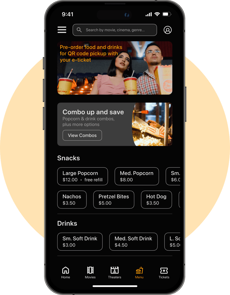


E-ticket
Scan QR code
to enter theaterSame for food
order pickupsquick and easy
Worry free
Reserved seats
less wait times
less contact

RESEARCH
Moviegoers shared frustration with long queues and a strong preference for a contactless experience
User research uncovered key insights into enhancing the movie-going experience:
Foundational Research and Analysis began with competitive analysis and industry trends. This helped me understand the market landscape and identify top competitors' strengths.
User Interviews were conducted with diverse movie enthusiasts. These interviews revealed preferences, behaviors, and pain points, such as frustration with long queues.
Users expressed a strong desire for contactless order pickups and theater entry. These insights challenged and refined my initial assumptions.
“We love going out to the movies together, even though finally getting to the theater itself can be hard for me.”
COMPETITIVE ANALYSIS + THE GAP
The competition doesn’t focus on integrated Food ordering despite some offering E-tickets
During my analysis of four main competitors, I found that none of them had supported ordering food ahead of time although many provided E-tickets, and during user interviews some users that used these apps previously voiced frustrations around having to watch ads on competitor’s apps. I understand this is a monetary strategy for them, but there might also be room for improvement on how the ads are delivered to users.

Fandango

Regal

Movietickets.com

AMC Theaters
One user interviewed disliked theater lines due to leg pain from prolonged standing.
Embracing a contactless movie-going experience offers benefits beyond convenience for users, addressing diverse needs such as:
Enhanced Accessibility - It accommodates individuals with mobility challenges or medical conditions, like leg pain from standing, providing a more comfortable experience.
Efficiency - Streamlined processes reduce wait times and improve overall satisfaction, appealing to a broader audience seeking smoother transactions.
Safety and Hygiene - Minimizing physical contact supports health measures, making theaters more appealing in a post-pandemic landscape.
THE MAIN INSIGHT
Users need the ability to easily find the movies they are looking for
The first Usability test showed that users need the ability to easily find the movies they are looking for, as most had difficulty reading the text on the movie posters on the homepage, some disliked the food pop-up screen asking if they’d like to order food, and some users were confused by the layout of the seat selection screen.
Themes
Insights
Actionable Steps
Hard to read text
Most users had difficulty reading the text on the movie posters on the home screen.
Users need the ability to easily find the movies they are looking for.
Add text labels that correspond to the Movie poster images on the home screen to make them more readable.
Food Pop-up screen
Some users were frustrated by the pop-up screen asking if they’d like to order food
Users find pop-up screens to be disruptive and/or frustrating.
Remove the food order pop-up and add the menu to the main navigation for easy access.
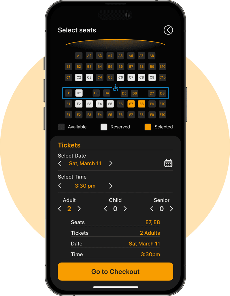
Confusing seat selections
Some users experienced confusion during the seat selection process.
Users would benefit from a cohesive seat selection process.
Streamline seat selection and make buttons similar and easily recognizable.
THE RETIRED MOVIE BUFF PERSONA

THE DESIGN
Setbacks and new design direction
Difficulties were revealed regarding reading movie poster text, confusion during seat selection and frustrations caused by the food menu modal leading us to prioritize clearer visuals and a more intuitive seat selection process.
TESTING AND IMPROVEMENTS
3 Major improvements in my design
Based on feedback and insights from testing, I iterated my design over the span of 2 weeks with 3 major improvements:
Readability
Some text on movie posters
were too small to readText labels were added to
movie poster cards


Disruptions
Due to negative feedback
the food order modal
was removedFood menu was then
moved to main navigation
for easy discoverability
Inconsistency
Confusion over seat
selection led to a redesignMore consistent visually

FINAL SCREENS
The final product

Clickable Prototype
Style guide

Link to my full Figma work file here
CONCLUSION AND LESSONS LEARNED
What I'd do differently next time
Cinepass prioritizes users, offering a streamlined, contactless movie-going experience with easy food pickups and theater entry, perfect for today's post-pandemic world. That being said, here are a few things I learned:
Clarity and Accessibility. Ensuring text readability on movie posters and clear, intuitive navigation is crucial for user satisfaction and ease of use.
User-Centered Functionality. Addressing users' pain points, such as frustration with long queues and desire for contactless options, improves overall experience and accessibility.
Streamlined Processes. Simplifying the seat selection and checkout processes while removing disruptive elements like pop-ups enhances usability and reduces user confusion.
Thank you for reviewing my work! 😊
For work inquiries, or just to connect, email me at jcolceri@gmail.com

