BudgetChef
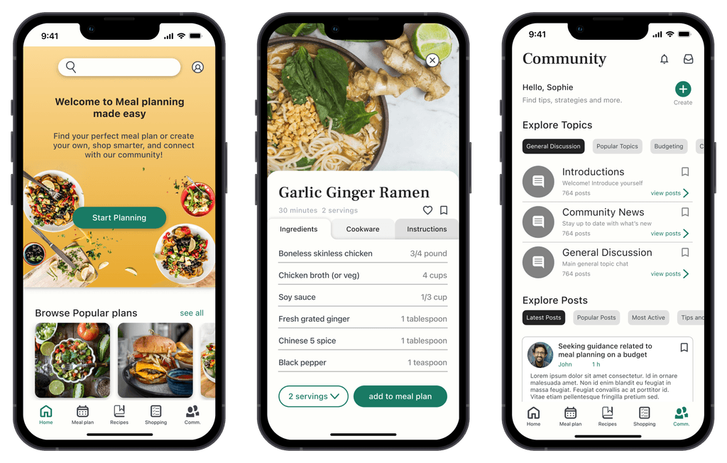
Empowers users with custom meal plans and budgeting tools, while fostering a supportive community.
Timeline
October - December 2023 (12 weeks)
My Role
Google UX Design Certificate Solo Project
THE PROBLEM
There is an accessibility gap for affordable personalized
meal planning solutions with community support
THE SOLUTION
Accessibility and fostering inclusivity are key
Personalized
Dietary selections
Allergies
Dislikes
Household size
Affordable
Budgeting
Categorized
Budget tips
Community
Localized support
Community events
Share tips, recipes,
and strategiesSeek or give advice
RESEARCH
Valuable insights were gained regarding the needs and challenges of users
I conducted primary and secondary research, competitive analysis, and User interviews.
Key findings highlighted the significance of personalized solutions, considering dietary restrictions, allergies, and household sizes
Ideation through crazy eights and How Might We’s helped me focus insights into actionable solutions.
Revisiting competitor analysis after User testing feedback confirmed a new direction for design.
“How might we enhance community engagement to empower users through connection and collaboration?”
COMPETITIVE ANALYSIS + THE GAP
Main competitors don't focus on community or initiatives for social good
During my analysis of four main competitors, I found that none of them had features based around community aside from a few having options for community submitted recipes, and the main interaction of users was through recipe reviews.

Yummly

Mealime

Plan to Eat

PlateJoy
Some of my first round interviewees mentioned it would be nice to have an area for community support
Taking into account user testing feedback regarding community functionality, I conducted a second round of User Interviews to expand on this topic, and validate a new direction for design.
INTERVIEW QUESTIONS:
What are some challenges you face when it comes to budgeting for groceries and planning meals?
How do you decide what meals to cook during the week, and what influences those decisions?
Do you have a network or community that you turn to for cooking tips, budgeting advice, or meal ideas?
What are your goals when it comes to meal planning and budgeting for groceries?
How would you like to communicate with others about meal planning?
THE MAIN INSIGHT
Most users expressed a preference for connecting with others online to share recipes, tips, and meal planning strategies.
Through affinity mapping, 3 main themes emerged highlighting insights pertaining to community functionality.
Themes
Insights
Actionable Steps
Support and advice
Users value the ability to connect with others to exchange cooking tips, budgeting advice, and meal ideas.
Online communities provide a platform for users to seek support, share experiences, and learn from one another.
Access to a diverse network of peers enhances users' confidence in their meal planning and budgeting decisions.
TheInformation exchange
Online platforms facilitate recipe, shopping, and budget-sharing among users, fostering collaborative knowledge exchange.
Users value discovering new cooking skills, budget-friendly recipes, and creative meal ideas shared by community members.
Community information exchange enhances users' meal planning capabilities.
Sense of belonging
Online cooking groups create a supportive environment where individuals feel valued and understood.
Community engagement fosters meaningful connections and friendships among users.
Community motivates users to explore recipes, overcome cooking challenges, and reach meal planning goals.
THE COMMUNITY ORGANIZER PERSONA
THE DESIGN
Setbacks and a new direction for community
The design solution in this study evolved from its original concept. After 4 weeks initially focusing on personalized meal planning, user testing highlighted the importance of community functionality. Second round user interviews led to a pivot towards prioritizing a community-driven solution. It was a lesson in remaining receptive to insights.
TESTING AND IMPROVEMENTS
3 Major improvements in my design
Based on feedback and insights gained from testing, I designed a new solution to accompany my original design over the span of 6 weeks with 3 major improvements:
Community hub
Forum list replaced with a
Community Dashboard with
added functionality
Local support
Added Local page
Local Events
Grocery and other
market resources
Interactions
Added Post replies
Bookmark posts
Share attachments
FINAL SCREENS
The final product
Clickable Prototype
Style guide
Link to my full Figma work file here
CONCLUSION AND LESSONS LEARNED
What I'd do differently next time
Beyond the final product I am grateful to go through the UX process, and the feeling of fulfillment that it brings. That being said, here are a few things I learned:
Iterate often. This is my second iteration of this portfolio case study. After reviewing the first layout, I found it too detailed and made it more concise. I realized I don't need to show every detail (that’s what my slide deck is for). I will be applying this approach to future studies.
Be insight driven. After weeks of research, a second round of interviews revealed the importance of community functionality, leading to a pivot towards a community-driven solution. This taught me to remain receptive to insights at any stage, as design isn’t always linear.
Always seek feedback. I'm grateful for feedback that highlighted UI mistakes and trade-offs between mobile and web versions. It reminded me to always seek feedback in the design process. I focused on designing the best app and web experience without letting my biases or assumptions lead the way.
Thank you for reviewing my work! 😊
For work inquiries, or just to connect, email me at jcolceri@gmail.com


